For this project, we were asked to collect data on our gratitude and self-care over a 10-day period. We then created a data visualization to communicate any patterns found in the data.
Research
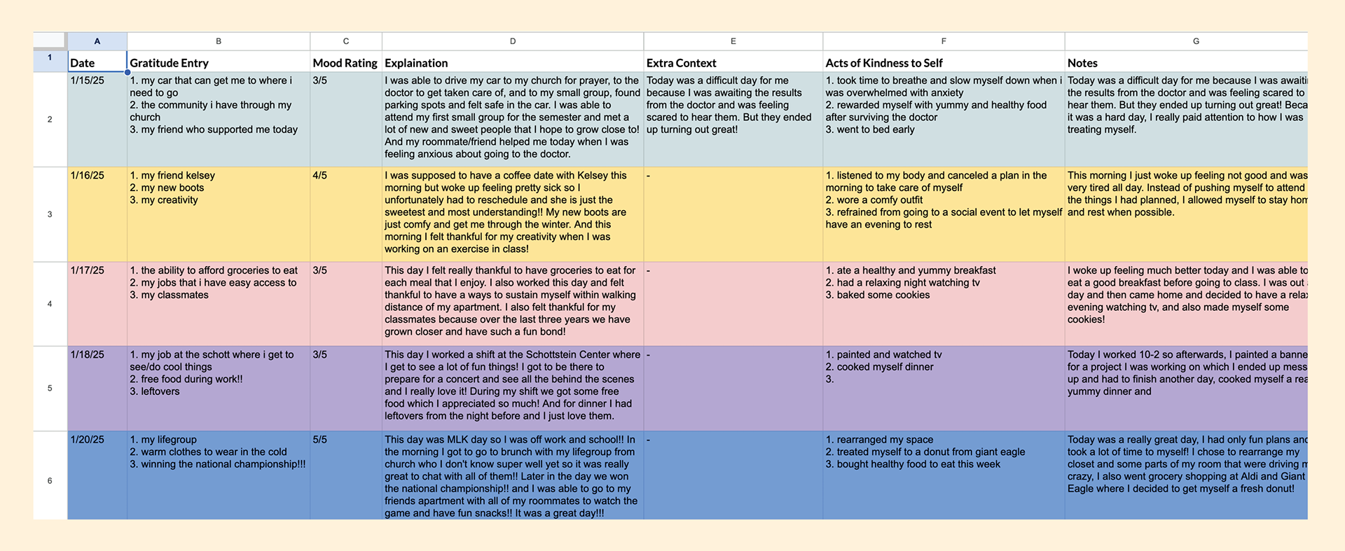
To begin, I collected data from January 15th through January 26. Each day, I recorded the following
- date
- three items of gratitude
- a mood rating (1-5)
- locations I was in that day
- and three things I did to show kindness to myself
- an explanation of each item of gratitude and kindness
I color coded them by the day of the week they occurred.
- date
- three items of gratitude
- a mood rating (1-5)
- locations I was in that day
- and three things I did to show kindness to myself
- an explanation of each item of gratitude and kindness
I color coded them by the day of the week they occurred.
Data Analysis
Once I had collected all of my data, I began analyzing and organizing it.
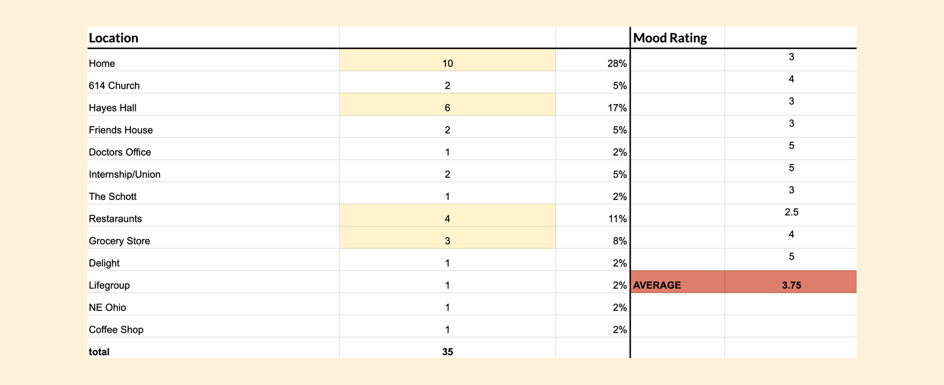
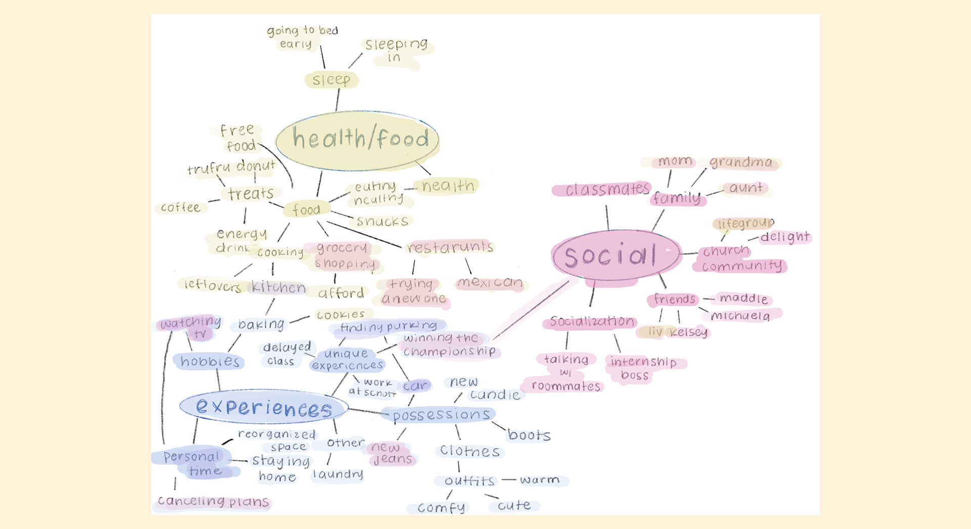
Quantitative data based on common locations, averaged mood rating
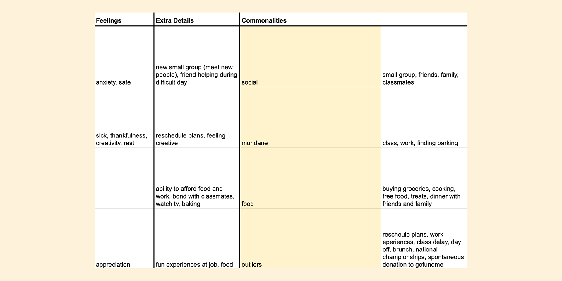
Feelings noted, commonalities between items
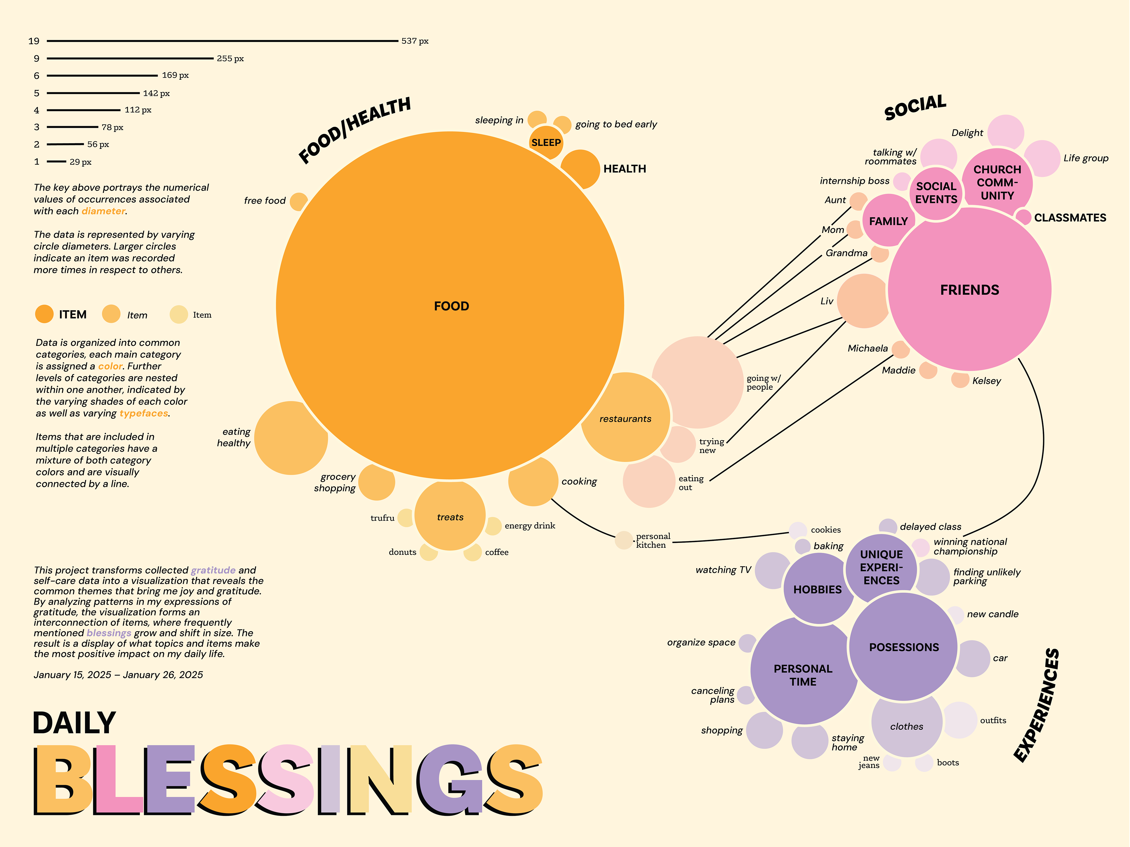
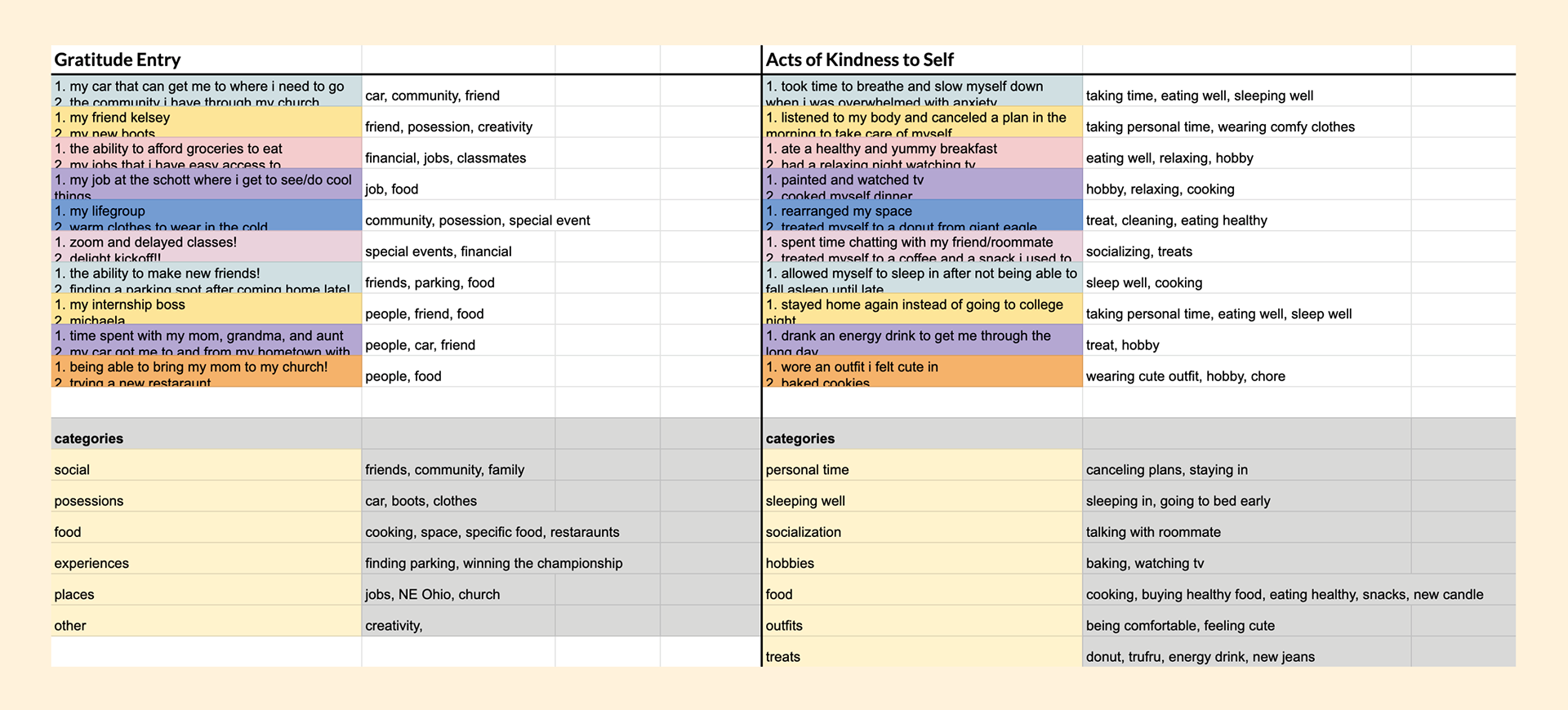
The main data utilized in my visualization, grouping items by common categories
Concept Ideation
Once I had analyzed my data, I began ideating concepts of how I could display the findings. I came up with three different concepts:
1) showing the found categories
2) showing my mood based on the activities
3) showing my mood based on mundane vs. unique experiences
From there, I sketched ways to visualize those concepts:
1) showing the found categories
2) showing my mood based on the activities
3) showing my mood based on mundane vs. unique experiences
From there, I sketched ways to visualize those concepts:
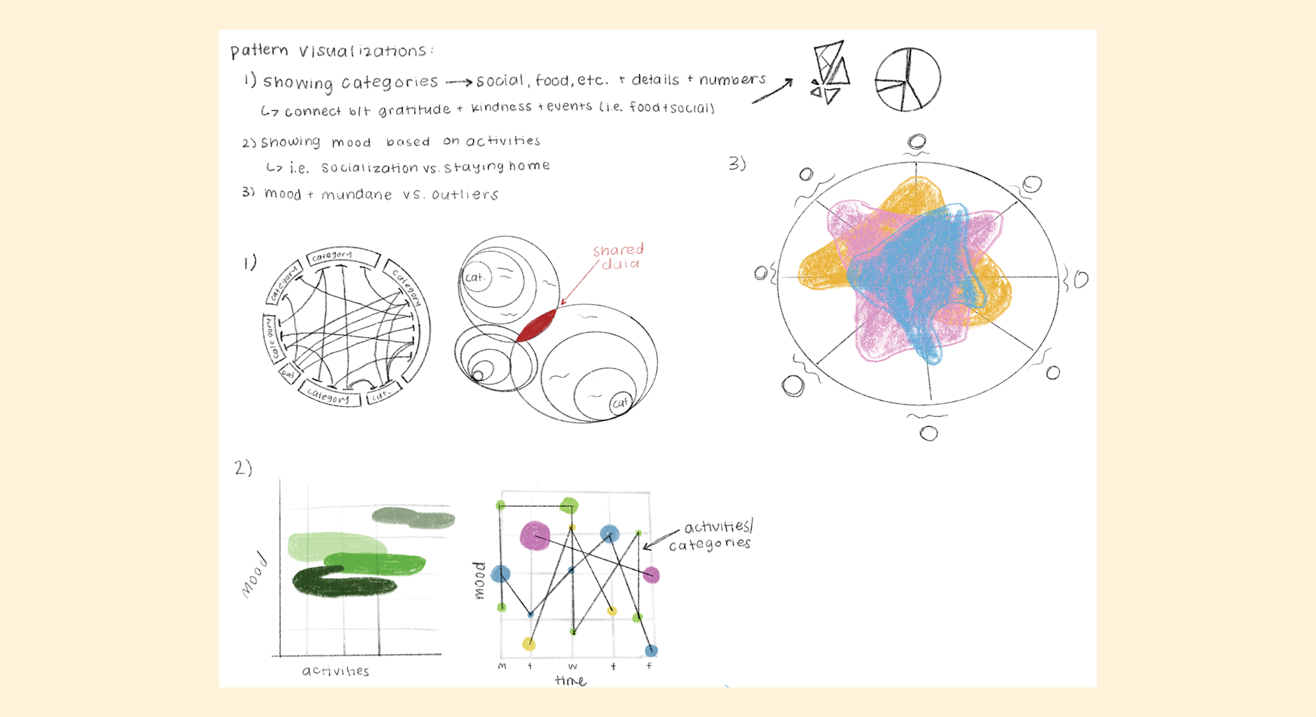
We then had a small group critique of these sketches and discussed which concepts and visualizations worked the best. My classmates and I decided that the second ideation for concept one was the most effective.
I chose to move forward with the concept of displaying the categories of information.
My goal with this concept was to visualize the things that commonly made me feel grateful or show kindness to myself, as well as illustrate the interconnected nature of all of the aspects of my life.
My goal with this concept was to visualize the things that commonly made me feel grateful or show kindness to myself, as well as illustrate the interconnected nature of all of the aspects of my life.
Concept Refinement
Once I decided on my concept, I created a web map to begin to visualize how things were connected, utilizing different colors for each main category and connecting items using the overlapping of color:
From there, I made two different sketches based on my original visualization method. The right image is the execution of the method using my real data, and it was at this time that I realized that it was going to be very tricky to display this information clearly, given the nature of the data and its interconnections. Because of this, I sketched the left image which focused less on the layers and groupings and more on the connections.
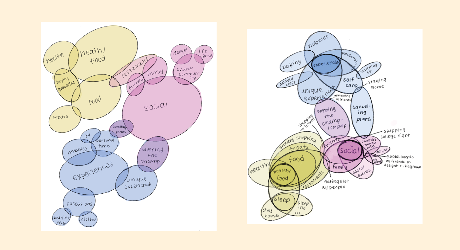
I then had a conversation with my professor about my concerns and she suggested that I focus more on the web map that I had created because it was clearer and more effective. I agreed and decided to move forward with this, and began to vectorize the map.
The information is organized by the following parameters:
- colors indicating the three main categories
- categories within each main category indicated by shade of each color and varying typefaces
- connections between items indicated by lines as well as overlapping of their respective colors
- colors indicating the three main categories
- categories within each main category indicated by shade of each color and varying typefaces
- connections between items indicated by lines as well as overlapping of their respective colors
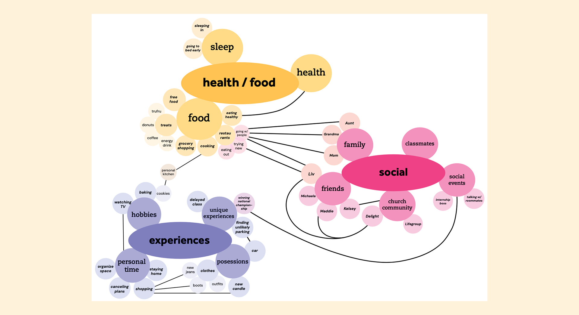
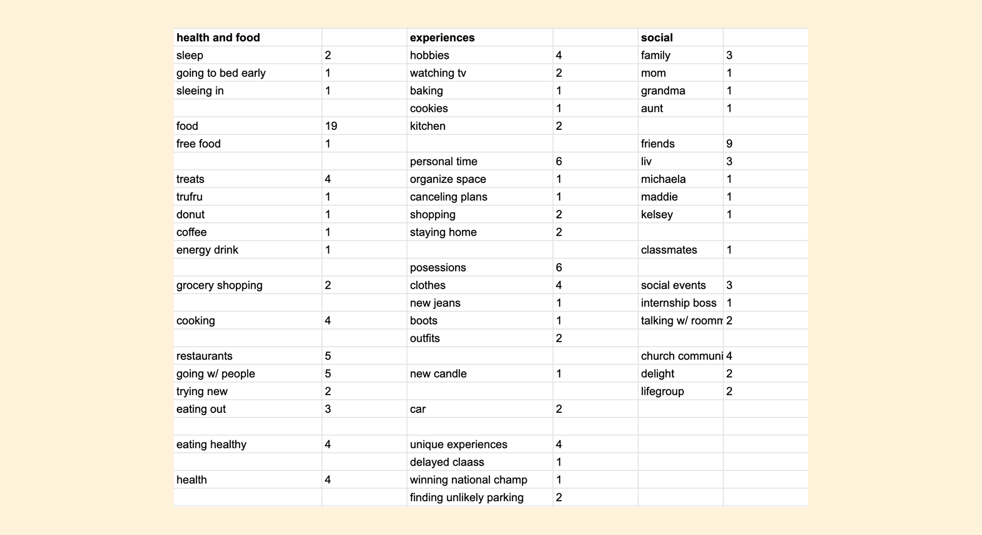
From this, I wanted to add another level of data. I decided to make the circles different sizes to indicate how often that item came up in my data to achieve my goal of visualizing how aspects of my life impact me. To do this, I first began by counting every time each item appeared in the data as shown:
I then utilized ChatGPT as a tool to help me decide on the sizes of the circles so that they would be proportional, scaled based on diameter, and to fit on the artboard. I accomplished this by providing it the data, asking it to provide the diameters in pixels so they would fit in an 18x24, and telling it the size I wanted the biggest circle to be (440 px). It produced all of the diameter lengths:
1 - 23.15 px
2 - 46.32 px
3 - 69.47 px
4 - 92.63 px
5 - 115.79 px
6 - 138.96 px
9 - 208.42 px
19 - 440 px
(I ended up scaling all of these up to fit the artboard better but kept everything proportional)
2 - 46.32 px
3 - 69.47 px
4 - 92.63 px
5 - 115.79 px
6 - 138.96 px
9 - 208.42 px
19 - 440 px
(I ended up scaling all of these up to fit the artboard better but kept everything proportional)
Using these lengths, I adjusted the sizes of each circle accordingly. Because this changed the nature of the visualization, I had to make a few intentional choices of how to keep all the information consistent:
- typography rules (i.e. when to have the text in the bubble, typefaces and hierarchy, alignment, type sizes and leading)
- color rules (when to have a stroke on the circles - indicates the item has more items stemming from it)
- the ways the lines interact with the bubbles and text
- typography rules (i.e. when to have the text in the bubble, typefaces and hierarchy, alignment, type sizes and leading)
- color rules (when to have a stroke on the circles - indicates the item has more items stemming from it)
- the ways the lines interact with the bubbles and text
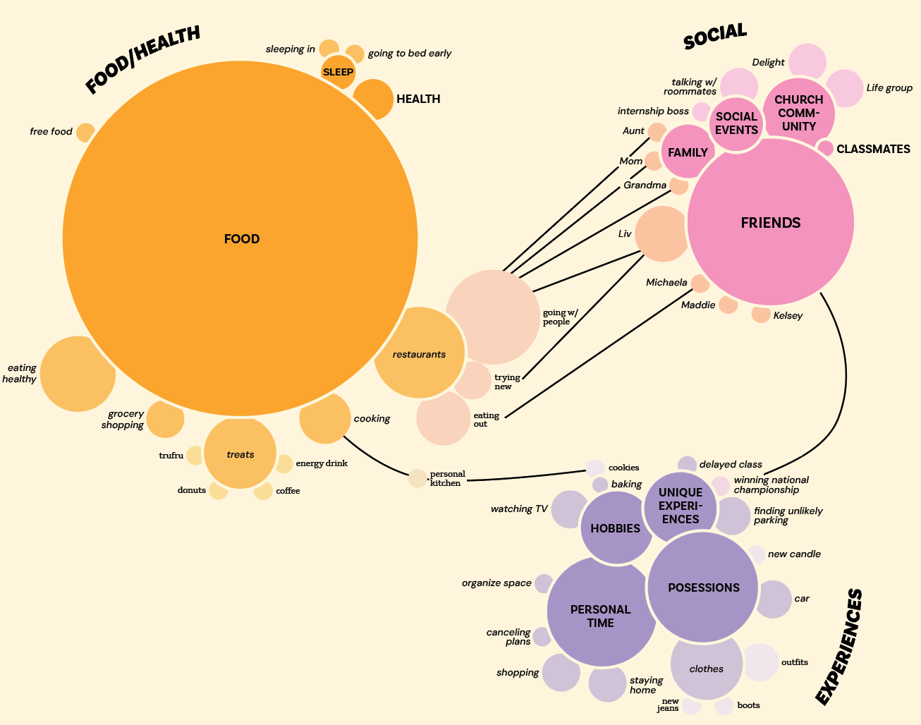
Finally, I added a title, Daily Blessings, and created some keys and guides to aid in understanding the visualization. I created a key that explains the diameter sizes and one that explains the differentiations in color/typeface. I also added text that gives context to the project and explains what everything means.
Final poster: