This project prioritized abstractions of natural objects that were then repeated and turned into patterns. I aimed to communicate movement as my primary principle, and I did so by using a pattern form that ebbs and flows across the page. I also aimed to create a branding between my cards and envelopes, unlike most cards you buy at the store. I took the same pattern and applied it very subtly to my envelopes to create a harmonious relationship between them. I wanted to keep the design on the envelope quaint to invite curiosity when opening the envelope and also to not overwhelm the front. After a card is put through the mail, there are so many stamps and words on it that I think the design would be covered up. I was inspired by oranges and flowers which I warped to follow my patterning grid. I originally planned to have the cutouts be on the front of the envelope so that the address could be written on the card, but the more I thought about it, the more I didn’t really get the point. I still included the cut-out in the cards to invite the user to use it for a sneak peek or a surprise on the inside. This was one of my very first times using Adobe Illustrator so it was quite time-consuming to complete with the little knowledge I had. I was very pleased with the quality of my craft on both the cards and envelopes. I am glad that I took time and patience to sit and intently craft them because it really created a clean and appealing look if someone were to buy them or give them away.
View full process here.
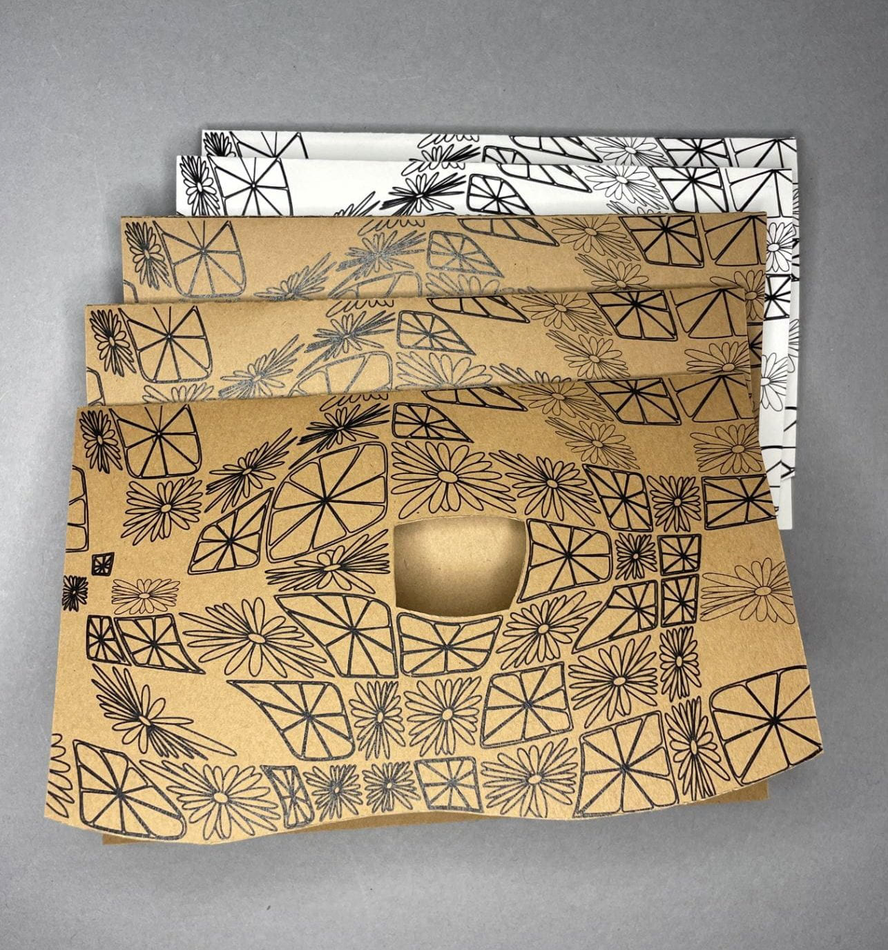
Final cards.
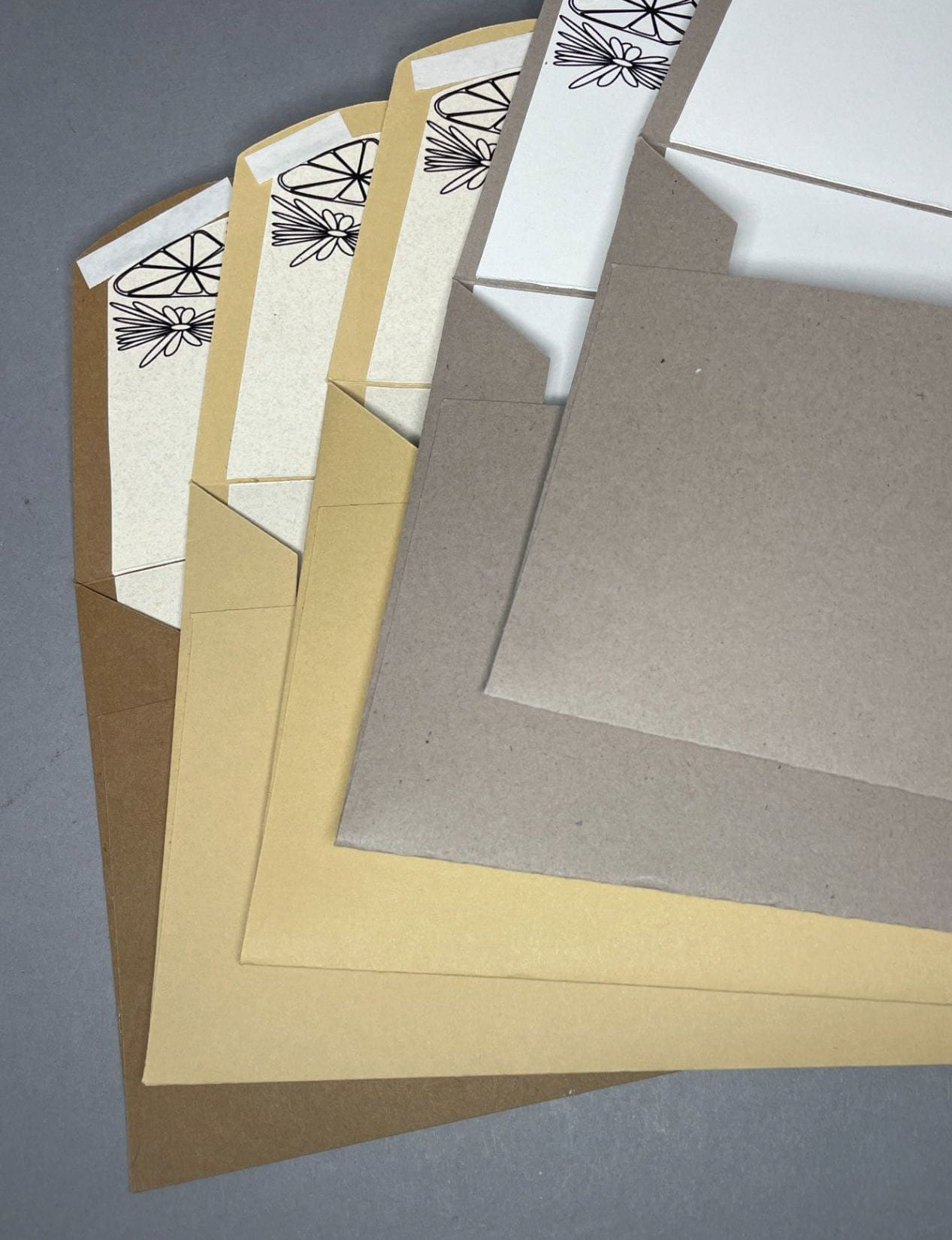
Final envelopes.